Client
Barnett Waddingham
Industries
Professional Services
Duration
12 Weeks
Services
Research & Discovery UX Design User Testing UI Design

The Challenge
The existing benefits platform wasn't delivering for either audience. For employees, navigating and understanding their workplace benefits was unnecessarily complex. For the sales team, the product lacked the polish and usability needed to win new business with confidence. Barnett Waddingham needed a complete rethink of the employee benefits experience, from the ground up.

Screenshot from the UX Audit
A structured end-to-end design process ran across five phases, moving from deep user research through to a fully tested design system. Every decision was grounded in evidence from real users rather than assumption.
Screenshot from the UX Audit
Research & Discovery
We opened with a stakeholder workshop to define scope and set the direction for the user research, identifying the platform's primary users, their typical tasks and priorities. This shaped our recruitment profile and ensured the research was grounded in real user behaviour from the start.
We then conducted task-based user testing on the existing benefits platform, capturing the wants, needs, behaviours and frustrations of employees engaging with workplace benefits day to day. Alongside this, we mapped existing user journeys, carried out a UX audit of the current platform and completed a competitor analysis of other employee benefits solutions, building a clear picture of where the platform was falling short.
Screenshot from the UX Audit
Our Approach
We opened with a stakeholder workshop to define scope and set the direction for the user research, identifying the platform's primary users, their typical tasks and priorities. This shaped our recruitment profile and ensured the research was grounded in real user behaviour from the start.
We then conducted task-based user testing on the existing benefits platform, capturing the wants, needs, behaviours and frustrations of employees engaging with workplace benefits day to day. Alongside this, we mapped existing user journeys, carried out a UX audit of the current platform and completed a competitor analysis of other employee benefits solutions, building a clear picture of where the platform was falling short.
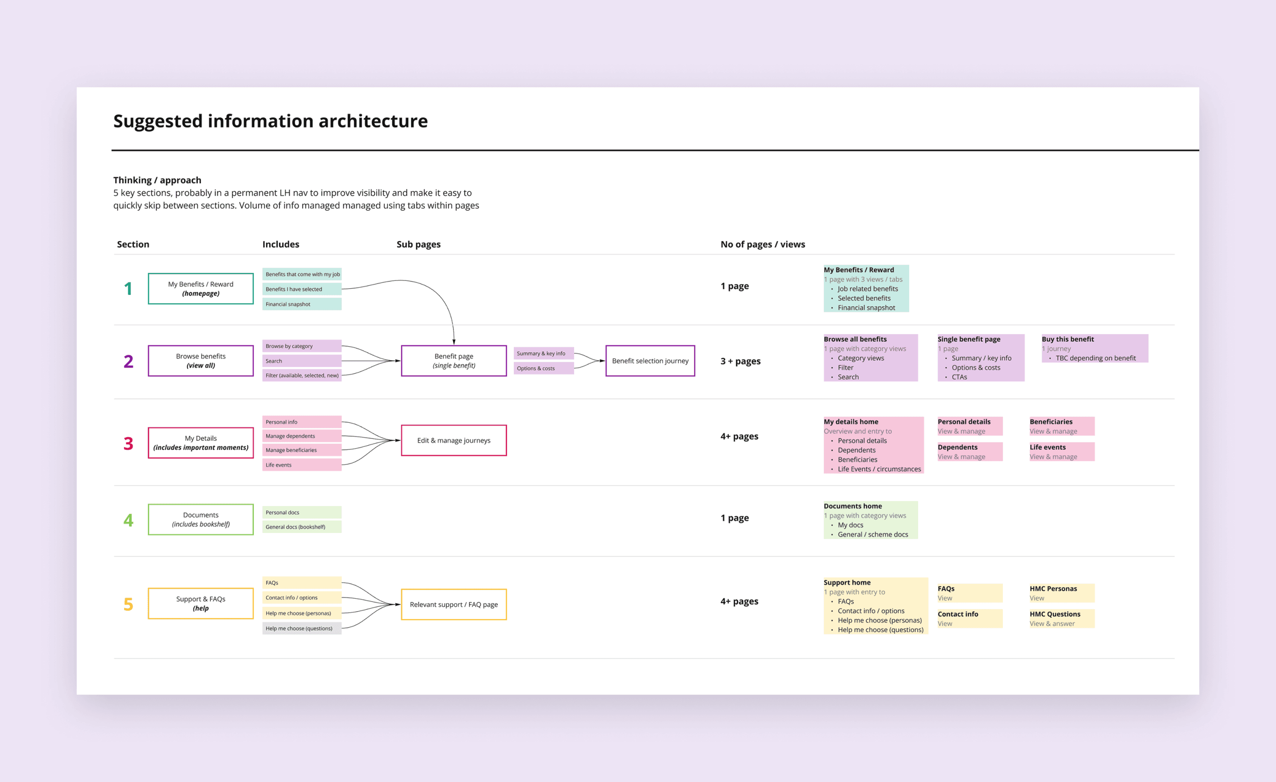
Information Architecture
UX Design
With a solid evidence base in place, we moved into UX design, refining user journeys, simplifying navigation and reducing the overwhelming volume of on-screen content. Re-architecting the information structure was central to this phase, bringing the platform into alignment with how users actually think about and access their benefits. A particular focus was finding the right data visualisation approaches to make complex financial and benefits information feel clear and accessible rather than intimidating. Low-fidelity wireframes were developed in preparation for user testing.

Screenshot of the User Testing Report
User Testing
The low-fi prototype was tested remotely with real users, reflecting the environments and devices they actually use. Scenario and task-based testing validated our design thinking, checking comprehension, navigational confidence and overall usability across the redesigned benefits platform. Findings were compiled into a detailed report, shared with key stakeholders, and used to directly inform the high-fidelity design phase.

Moodboard
UI Design
The penultimate phase involved developing a scalable and flexible UI by creating a design system based on the atomic design methodology. LION+MASON established a typographic scale for various devices, an accessible colour palette with multiple tints and shades, and a centralised library of reusable components for both desktop and mobile. The design system serves as a single source of truth that can be shared across teams and managed centrally.
LION+MASON also held sessions with Barnett Waddingham's internal design team to walk them through the system and facilitate the handover, ensuring they are equipped to maintain and enhance it moving forward.

Screenshot of the Design System
Alternate themes
To attract a broader range of businesses, Barnett Waddingham requested from the outset that their new benefits platform be customisable with different themes. The final stage of the project saw LION+MASON developing several alternate themes for the platform, demonstrating the potential options when presenting the product to prospective customers.

Homepage using an alternate theme
“LION+MASON impressed with their flexibility, communication, and delivery. As a result our conversion rate for new business wins is now around 90%.”
Julia Turney
Partner and Head of Platform and Benefits – Barnett Waddingham

